
Poop Button
How to make a button that visually resembles a poop emoji on hover. No SVG or images — just pure CSS.
Many frontend developers have at least once wanted to create their own UI kit and open source it. Without much thought, I decided to make a bullshit UI kit. But, as often happens, my enthusiasm lasted... for just one button.
In the end, it turned out to be a regular button with a hover effect. When you hover over it, it visually turns into a poop.
The entire "drawing" is created thanks to the CSS property clip-path on the ::after pseudo-element. We simply cut out the shape using specified percentages — no SVG, no img.
Example code — below. You can also see this example in the GitHub Gist.
<style>
.button {
width: fit-content;
display: block;
border: 1px solid black;
padding: 8px 16px;
border-radius: 6px;
cursor: pointer;
position: relative;
z-index: 1;
transition: all 0.8s;
}
.poop {
width: 100%;
padding-top: 100%;
position: absolute;
left: 0;
bottom: 0;
z-index: -1;
pointer-events: none;
}
.poop::after {
content: "";
display: block;
position: absolute;
inset: 0;
transition: all 0.8s cubic-bezier(0.075, 0.82, 0.165, 1);
transform: translateY(-30%);
clip-path: polygon(
39% 7%,
40% 12%,
39% 16%,
37% 21%,
36% 26%,
38% 29%,
33% 31%,
29% 34%,
25% 39%,
25% 45%,
26% 50%,
21% 53%,
15% 57%,
14% 63%,
15% 69%,
12% 72%,
8% 75%,
4% 80%,
4% 85%,
5% 91%,
9% 95%,
14% 97%,
22% 97%,
30% 96%,
38% 95%,
41% 94%,
48% 97%,
60% 97%,
77% 97%,
85% 96%,
95% 92%,
98% 86%,
96% 79%,
92% 73%,
86% 71%,
83% 72%,
86% 67%,
86% 60%,
84% 55%,
79% 51%,
75% 51%,
76% 44%,
75% 40%,
71% 35%,
66% 34%,
64% 35%,
65% 31%,
64% 26%,
61% 20%,
56% 15%,
50% 12%
);
}
.button:hover {
text-shadow: 1px 0 1px white, -1px 0 1px white, 0px 1px 1px white, 0px -1px
1px white, 1px 1px 2px white, -1px -1px 2px white, 1px -1px 2px white, -1px
1px 2px white;
border-color: transparent;
}
.button:hover .poop::after {
background-color: brown;
transform: translateY(0%);
}
</style>
<div class="button" role="button" tabindex="0">
<div role="img" class="poop"></div>
Button
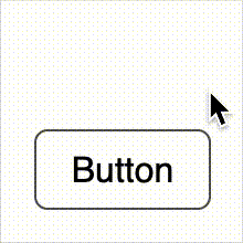
</div>Here's what it looks like:
What do you think?
Should I make a more complete UI kit in this style? Would you like, for example, toggles in the form of toilet paper or inputs in the form of a puddle?
Send me your ideas by email or on social networks — maybe this will really take shape...
Read next
- February 12, 2026

Website Redesign in the Age of AI and the End of Traditional SEO
The story of another redesign of my website, GSAP animations, and why design no longer drives search traffic in the age of AI.
- January 9, 2026

Traffic Report: December 2025 – January 2026
Website traffic over the last 30 days — a short report and observations.

