
2025年5月28日
便便按钮
如何制作一个在悬停时视觉上类似于便便表情的按钮。不用 SVG 和图片——只用纯 CSS。
许多前端开发者都曾想过要做自己的 UI-kit 并开源。我也不例外,随手就决定做一个 bullshit UI-kit。 但和很多人一样,我的热情只够……做出一个按钮。
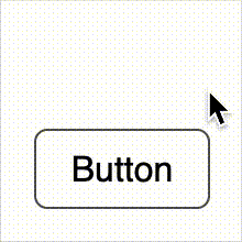
最终做出来的就是一个带有悬停效果的普通按钮。 当你把鼠标移上去时,它会变成一坨便便。
整个"图案"都是通过 ::after 伪元素上的 CSS 属性 clip-path 实现的。 我们只需用百分比裁剪出形状——无需 SVG,无需 img。
代码示例如下。 你也可以在 GitHub Gist 查看这个例子。
<style>
  .button {
    width: fit-content;
    display: block;
    border: 1px solid black;
    padding: 8px 16px;
    border-radius: 6px;
    cursor: pointer;
    position: relative;
    z-index: 1;
    transition: all 0.8s;
  }

  .poop {
    width: 100%;
    padding-top: 100%;
    position: absolute;
    left: 0;
    bottom: 0;
    z-index: -1;
    pointer-events: none;
  }

  .poop::after {
    content: "";
    display: block;
    position: absolute;
    inset: 0;
    transition: all 0.8s cubic-bezier(0.075, 0.82, 0.165, 1);
    transform: translateY(-30%);
    clip-path: polygon(
      39% 7%,
      40% 12%,
      39% 16%,
      37% 21%,
      36% 26%,
      38% 29%,
      33% 31%,
      29% 34%,
      25% 39%,
      25% 45%,
      26% 50%,
      21% 53%,
      15% 57%,
      14% 63%,
      15% 69%,
      12% 72%,
      8% 75%,
      4% 80%,
      4% 85%,
      5% 91%,
      9% 95%,
      14% 97%,
      22% 97%,
      30% 96%,
      38% 95%,
      41% 94%,
      48% 97%,
      60% 97%,
      77% 97%,
      85% 96%,
      95% 92%,
      98% 86%,
      96% 79%,
      92% 73%,
      86% 71%,
      83% 72%,
      86% 67%,
      86% 60%,
      84% 55%,
      79% 51%,
      75% 51%,
      76% 44%,
      75% 40%,
      71% 35%,
      66% 34%,
      64% 35%,
      65% 31%,
      64% 26%,
      61% 20%,
      56% 15%,
      50% 12%
    );
  }

  .button:hover {
    text-shadow: 1px 0 1px white, -1px 0 1px white, 0px 1px 1px white, 0px -1px
        1px white, 1px 1px 2px white, -1px -1px 2px white, 1px -1px 2px white, -1px
        1px 2px white;
    border-color: transparent;
  }

  .button:hover .poop::after {
    background-color: brown;
    transform: translateY(0%);
  }
</style>
<div class="button" role="button" tabindex="0">
  <div role="img" class="poop"></div>
  Button
</div>
效果如下:
你觉得怎么样?
要不要做一个更完整的这种风格的 UI-kit? 比如做成厕纸的开关、做成水坑的输入框,你会感兴趣吗?
欢迎通过邮箱或社交网络给我留言——说不定真的能做出来……

