
How I Built a Blog & Personal Site with Next.js (Free Hosting!)
Hi! I decided to create my own blog and personal site. For the blog, I used a ready-made template and customized it, while I built the personal page from scratch. In this article, I’ll share how I chose the template, modified it, designed the personal page, and developed the site. If you’re looking to create something similar, you might find some useful ideas here.
Choosing a Template
When I started working on the blog, I realized that building it from scratch would take too long. So, I decided to look for ready-made Next.js templates. Their catalog offers solutions for blogs, online stores, personal pages, and even AI startup websites.
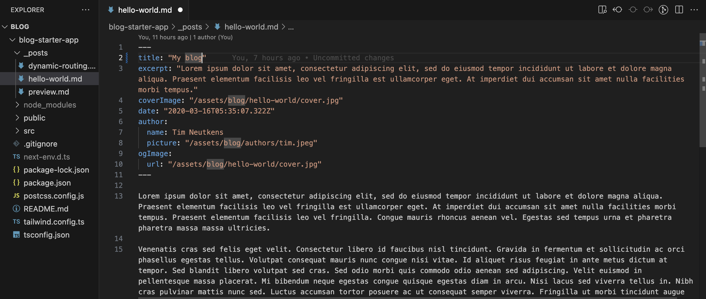
Among the blog templates, I chose one that doesn’t require a database. I wanted the site to be fully static, allowing me to host it on GitHub Pages, which doesn’t support databases.
My goal was to create a free blog without infrastructure costs. That’s why I selected a template that uses Next.js static generation and Markdown files as the data source. This approach makes it easy to add new articles while keeping everything server-free.
Setting Up the Project
To get started, create the project using the command line:
npx create-next-app --example blog-starter blog-starter-appAfter that, simply replace the template’s sample articles with your own.
The final step is setting up GitHub Pages for the repository and linking a CNAME to the desired domain.
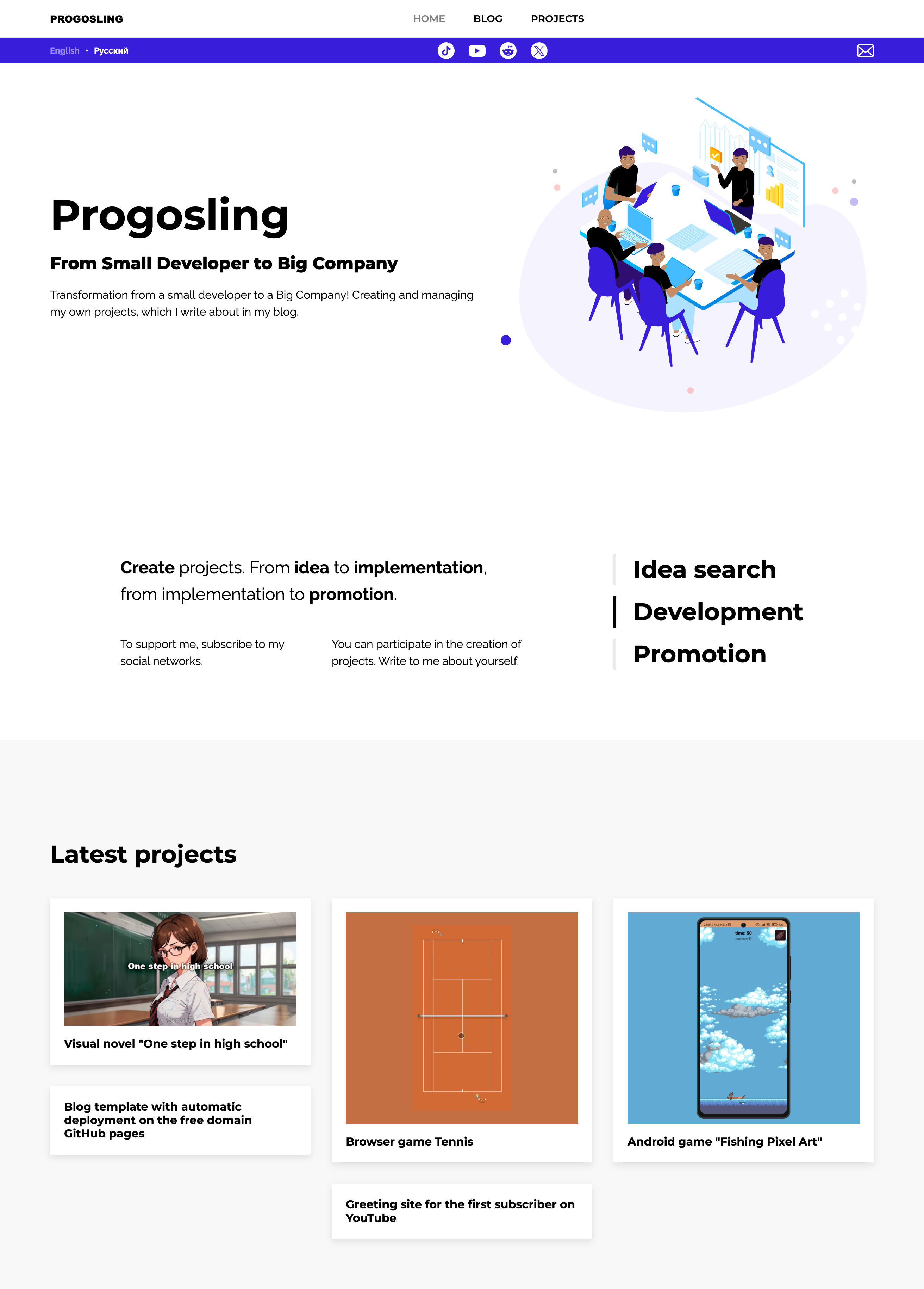
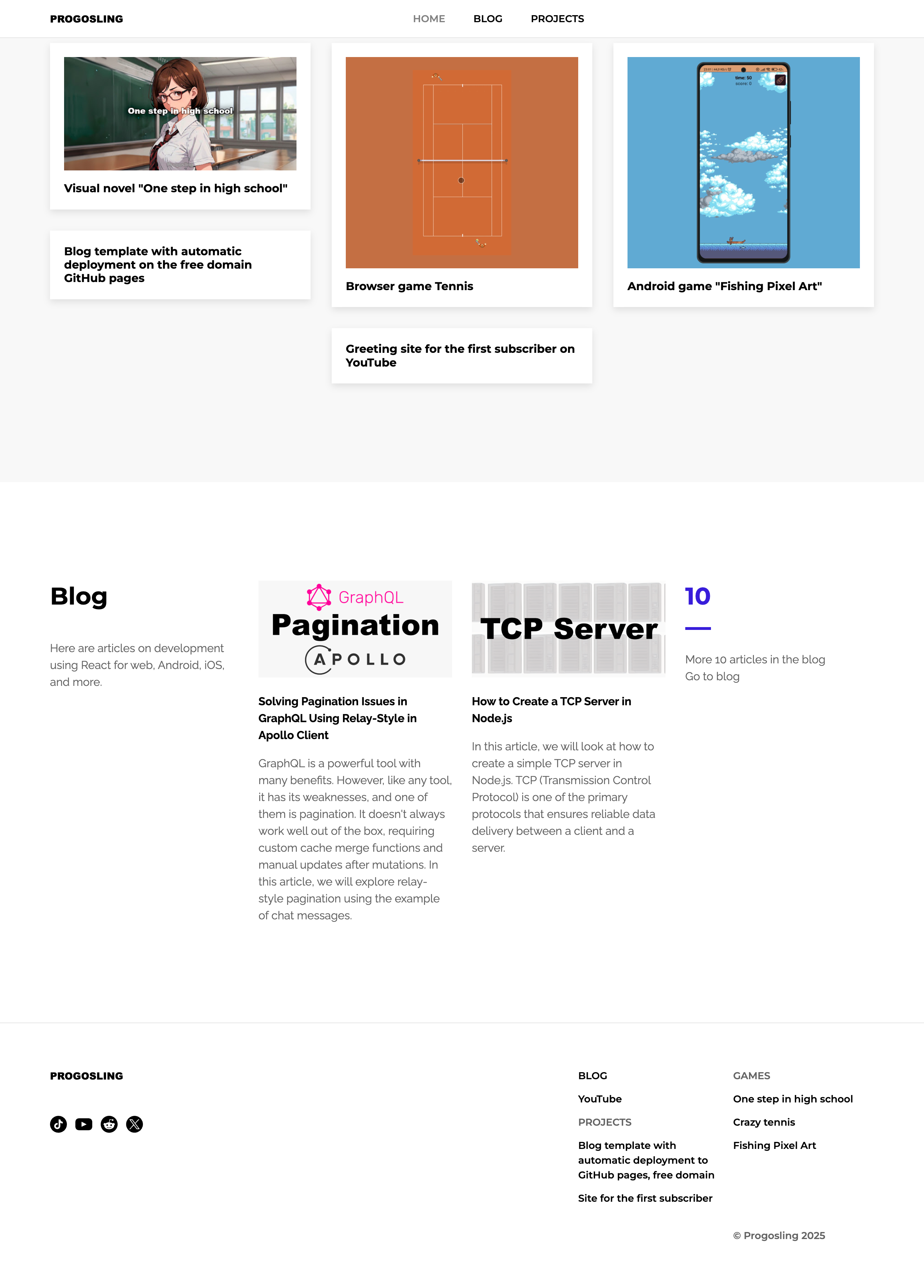
Designing the Personal Page
The blog was ready, but I also needed a personal page to showcase information about myself and my projects.
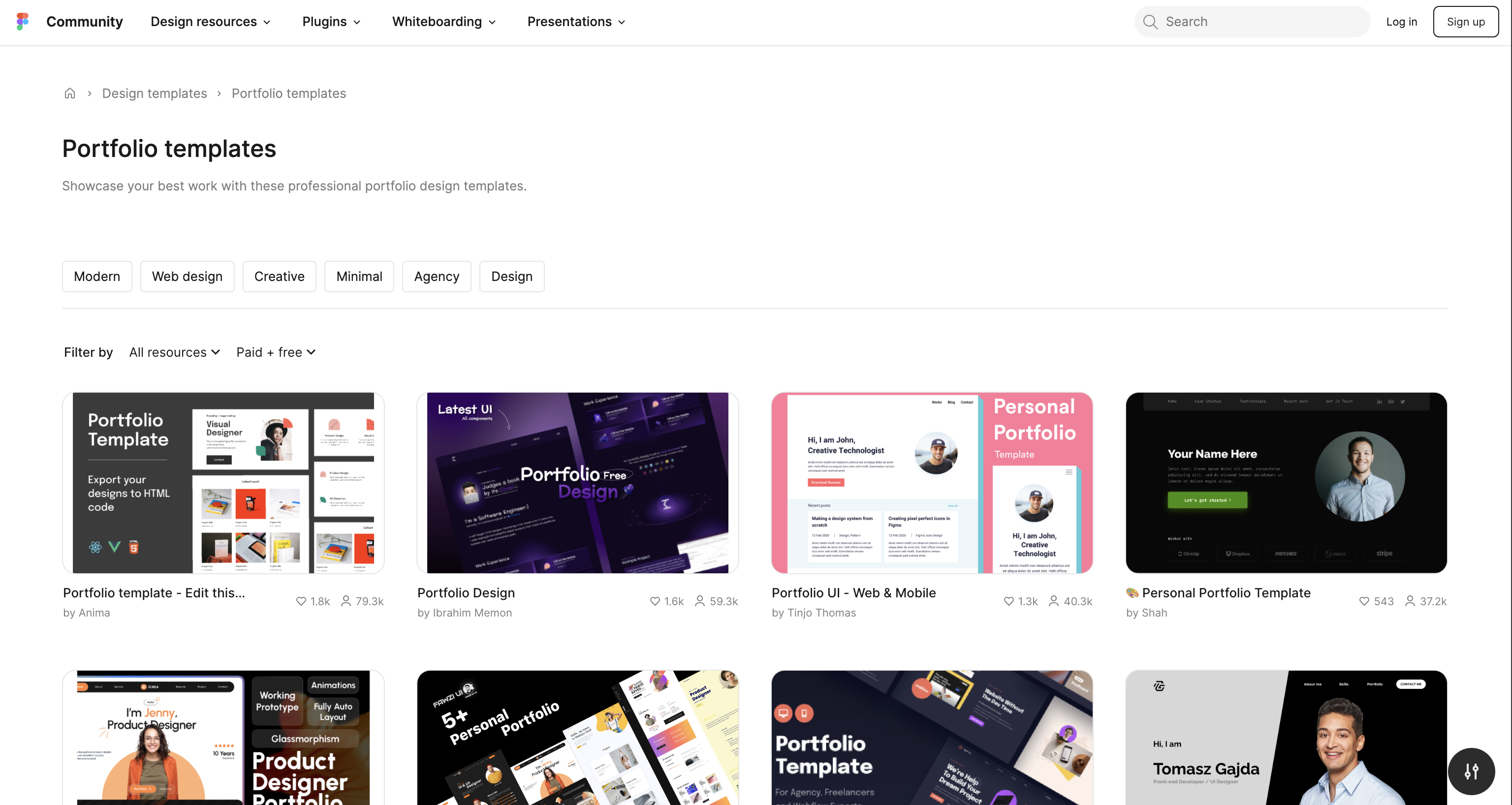
Figma Community offers plenty of free and paid templates for various projects. The key is to check the license. I was looking for Free to use options, but in the end, I simply took inspiration from existing designs and created my own.
Development and Implementation
For development, I used Next.js and Tailwind CSS.
- Next.js was a great fit since I integrated the personal page into the existing blog template.
- I chose Tailwind CSS for its convenience—it allows you to style elements directly in the code without needing separate CSS files. This speeds up development and keeps the code clean.
Thanks to this approach, the implementation took very little time.
Here’s an example of how the header is structured:
const Header: React.FC<{ opacity?: boolean }> = ({ opacity }) => {
  const { asPath, locale } = useRouter();
  const { t } = useTranslation();

  return (
    <>
      <header
        className={cn(
          "sticky top-0 w-full specm:h-[3.375rem] h-[2.25rem] z-10 font-montserrat font-semibold text-[0.875rem] flex items-center border-b border-neutral-200",
          opacity ? "bg-[#ffffff99]" : "bg-white"
        )}
      >
        <SpecContainer className="flex justify-between">
          <Link href="/" locale={locale} className="font-[arial-black]">
            PROGOSLING
          </Link>
          <div className="flex specm:gap-[2.5rem] gap-[0.625rem]">
            <Link
              href="/"
              locale={locale}
              aria-disabled={asPath === "/"}
              className="aria-disabled:opacity-50 aria-disabled:pointer-events-none hover:underline"
            >
              {t("common:header.home")}
            </Link>
            <Link
              href="/blog"
              locale={locale}
              aria-disabled={asPath === "/blog"}
              className="aria-disabled:opacity-50 aria-disabled:pointer-events-none hover:underline"
            >
              {t("common:header.blog")}
            </Link>
            <Link locale={locale} href="/#projects" className="hover:underline">
              {t("common:header.projects")}
            </Link>
          </div>
          <div className="specm:block hidden" />
        </SpecContainer>
      </header>
      <div className="bg-[#381DDB] font-raleway font-bold text-[0.75rem] text-white">
        <SpecContainer className="flex justify-between items-center">
          <nav className="flex gap-2 items-center">
            {locales.map(({ id, name }, i) => (
              <React.Fragment key={id}>
                {i > 0 && <span>•</span>}
                <Link
                  href={asPath}
                  locale={id}
                  aria-disabled={locale === id}
                  className="block py-[0.375rem] aria-disabled:opacity-50 aria-disabled:pointer-events-none"
                >
                  {name}
                </Link>
              </React.Fragment>
            ))}
          </nav>
          <ul className="flex specm:gap-2">
            {social.map(({ element, id }) => (
              <li key={id}>{element}</li>
            ))}
          </ul>
          <a href="mailto:[email protected]" className="group">
            {email}
          </a>
        </SpecContainer>
      </div>
    </>
  );
};
And here’s how the main page looks:
export default function Index({
  allPosts,
  postsCount,
}: {
  allPosts: Post[];
  postsCount: number;
}) {
  const { locale } = useRouter();
  const { t } = useTranslation();

  return (
    <Layout
      title={t("index-page:meta.title")}
      description={t("index-page:meta.description")}
      header={<Header />}
    >
      <div className="mt-[3rem]" />
      <Main />
      <div className="w-full specl:my-[6.25rem] specm:my-[5rem] my-[2.5rem] border-b border-neutral-200" />
      <AboutMe />
      <LastProjects />
      <Blog allPosts={allPosts} postsCount={postsCount} />
    </Layout>
  );
}
Final Thoughts
In the end, I achieved:
✅ A fully static blog — no backend, no database.
✅ A personal page — integrated into the project and customized to match my style.
✅ Free hosting — deployed on GitHub Pages.
Now, I can add content and continue developing the project.
If you’re thinking about creating your own site, try a similar approach — use ready-made solutions and adapt them to your needs.

